Customizing the VR headset experience

ArborXR’s VR team is working on implementing a 3D home environment, similar to the default environments available on the Quest 2. Currently, ArborXR only has support for a custom 360° Image/panorama. I was tasked with creating a seamless customization experience within the headset settings page. This also gave me an opportunity to rework the navigation within the customization page.
Talking to stakeholders
I started the project with a stakeholder kickoff meeting to clarify the business needs and goals. In this instance I collaborated with Darren, a developer on the Unity team and Alex, a Sr Front-end developer. He took me through the 3D model he had created in blender, and he pointed out the potential areas of customization. For MVP, ArborXR was only offering the ability to customize a banner area. Alex then helped connect the 3D model to a WebGL framework, which would allow users to interact with the 3D home environment within the customization menu.
Design problems and goals:
Simplify and streamline the navigation. The existing navigation poised a few problems. The left column was dedicated to the menu items, and the right column displayed the preview of the in-headset VR environment. The menu currently functioned as expandable accordions within a vertical scrolling frame (see right). This limited visibility of menu items within each accordion, forcing the user to scroll down to see all the contents within the accordion once expanded.
Empower users to customize their VR experience. My goal was to create a simple and effective UI pattern so that users could pick between the new 3D home environment or the existing 360° background. I decided to leverage existing UI patterns as much as possible to reduce the impact on engineering.
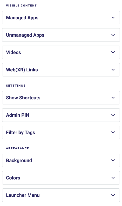
The Existing menu UI
The Outcome: A more immersive customization experience
Recognizing that complex interfaces can deter users, I streamlined the design to minimize cognitive load while maximizing flexibility. Because customization options are categorized into intuitive menus, users can effortlessly navigate through various settings, making it easy to modify the virtual environment to their liking.
Simplifying the navigation
The suggested navigation flow
In my design, when a user selects a menu item, the entire left section is dedicated to the contents of the selected menu item. There are no more expandable accordions. A back button provides access to the menu if needed. Because of the new navigation flow, the user is no longer disoriented and can maintain a sense of location.
A better preview experience
Since the preview window was limited to the right column, changes the user made were hard to see and largely dependent on the user’s screen resolution. To overcome this hurdle, I included an “expand” icon. When clicked, the “expand” icon would expand the preview window to the left pushing out the menu. Additionally, I asked Alex if it would be possible for a user to interact directly with the various customizable offerings within the 3D preview. This way, the user could click on the “Launcher Menu” icon on the preview, and it would quickly direct them to the related menu item.
The Result
Click “Background” or “Launcher menu” to interact with menu navigation within the prototype. Click the little expand icon in the top right corner of the preview window.